交错动画
你将学到什么:
-
For each property being animated, create a Tween.
- 交错动画由一个动画序列或重叠的动画组成。
- 要创建交错动画,需要使用多个动画对象。
- 一个AnimationController控制所有动画。
- 每个动画对象在间隔(Interval)期间指定动画。
- 对于要执行动画的每个属性都要创建一个Tween。
Staggered animations are a straightforward concept: visual changes happen as a series of operations, rather than all at once. The animation might be purely sequential, with one change occuring after the next, or it might partially or completely overlap. It might also have gaps, where no changes occur.
所谓交错动画,直接来说就是:视觉变化发生在一系列操作中,而不是一次性发生。 动画可能是纯粹顺序的,在下一个动画之后会发生一次更改,或者可能部分或完全重叠。 它也可能有间隙,没有发生变化。
This guide shows how to build a staggered animation in Flutter.
The following video demonstrates the animation performed by basic_staggered_animation:
In the video, you see the following animation of a single widget, which begins as a bordered blue square with slightly rounded corners. The square runs through changes in the following order:
- Fades in
- Widens
- Becomes taller while moving upwards
- Transforms into a bordered circle
- Changes color to orange
After running forward, the animation runs in reverse.
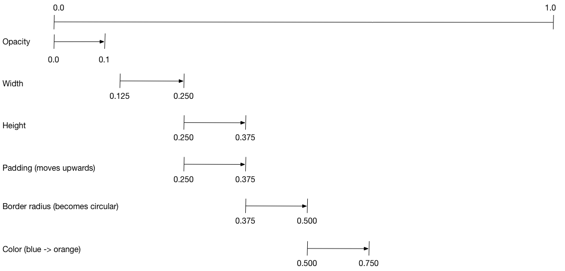
Basic structure of a staggered animation
What’s the point?
- All of the animations are driven by the same AnimationController.
- Regardless of how long the animation lasts in real time, the controller’s values must be between 0.0 and 1.0, inclusive.
- Each animation has an Interval between 0.0 and 1.0, inclusive.
- For each property that animates in an interval, create a Tween. The Tween specifies the start and end values for that property.
- The Tween produces an Animation object that is managed by the controller.
The following diagram shows the Intervals used in the basic_staggered_animation example. You might notice the following characteristics:
- The opacity changes during the first 10% of the timeline.
- A tiny gap occurs between the change in opacity, and the change in width.
- Nothing animates during the last 25% of the timeline.
- Increasing the padding makes the widget appear to rise upward.
- Increasing the border radius to 0.5, transforms the square with rounded corners into a circle.
- The padding and border radius changes occur during the same exact interval, but they don’t have to.
To set up the animation:
- Create an AnimationController that manages all of the Animations.
- Create a Tween for each property being animated.
- The Tween defines a range of values.
- The Tween’s
animatemethod requires theparentcontroller, and produces an Animation for that property.
- Specify the interval on the Animation’s
curveproperty.
When the controlling animation’s value changes, the new animation’s value changes, triggering the UI to update.
The following code creates a tween for the width property.
It builds a
CurvedAnimation,
specifying an eased curve.
See Curves
for other available pre-defined animation curves.
width = new Tween<double>(
  begin: 50.0,
  end: 150.0,
).animate(
  new CurvedAnimation(
    parent: controller,
    curve: new Interval(
      0.125, 0.250,
      curve: Curves.ease,
    ),
  ),
),
The begin and end values don’t have to be doubles.
The following code builds the tween for the borderRadius property
(which controls the roundness of the square’s corners), using
BorderRadius.circular().
borderRadius = new BorderRadiusTween(
  begin: new BorderRadius.circular(4.0),
  end: new BorderRadius.circular(75.0),
).animate(
  new CurvedAnimation(
    parent: controller,
    curve: new Interval(
      0.375, 0.500,
      curve: Curves.ease,
    ),
  ),
),
Complete staggered animation
Like all interactive widgets, the complete animation consists of a widget pair: a stateless and a stateful widget.
The stateless widget specifies the Tweens,
defines the Animation objects, and provides a build() function
responsible for building the animating portion of the widget tree.
The stateful widget creates the controller, plays the animation, and builds the non-animating portion of the widget tree. The animation begins when a tap is detected anywhere in the screen.
Full code for basic_staggered_animation’s main.dart
Stateless widget: StaggerAnimation
In the stateless widget, StaggerAnimation, the build() function instantiates an
AnimatedBuilder—a
general purpose widget for building animations. The AnimatedBuilder
builds a widget and configures it using the Tweens’ current values.
The example creates a function named _buildAnimation() (which performs
the actual UI updates), and assigns it to its builder property.
AnimatedBuilder listens to notifications from the animation controller,
marking the widget tree dirty as values change.
For each tick of the animation, the values are updated,
resulting in a call to _buildAnimation().
class StaggerAnimation extends StatelessWidget {
  StaggerAnimation({ Key key, this.controller }) :

    // Each animation defined here transforms its value during the subset
    // of the controller's duration defined by the animation's interval.
    // For example the opacity animation transforms its value during
    // the first 10% of the controller's duration.

    opacity = new Tween<double>(
      begin: 0.0,
      end: 1.0,
    ).animate(
      new CurvedAnimation(
        parent: controller,
        curve: new Interval(
          0.0, 0.100,
          curve: Curves.ease,
        ),
      ),
    ),

    // ... Other tween definitions ...

    super(key: key);

  final Animation<double> controller;
  final Animation<double> opacity;
  final Animation<double> width;
  final Animation<double> height;
  final Animation<EdgeInsets> padding;
  final Animation<BorderRadius> borderRadius;
  final Animation<Color> color;

  // This function is called each the controller "ticks" a new frame.
  // When it runs, all of the animation's values will have been
  // updated to reflect the controller's current value.
  Widget _buildAnimation(BuildContext context, Widget child) {
    return new Container(
      padding: padding.value,
      alignment: Alignment.bottomCenter,
      child: new Opacity(
        opacity: opacity.value,
        child: new Container(
          width: width.value,
          height: height.value,
          decoration: new BoxDecoration(
            color: color.value,
            border: new Border.all(
              color: Colors.indigo[300],
              width: 3.0,
            ),
            borderRadius: borderRadius.value,
          ),
        ),
      ),
    );
  }

  @override
  Widget build(BuildContext context) {
    return new AnimatedBuilder(
      builder: _buildAnimation,
      animation: controller,
    );
  }
}
Stateful widget: StaggerDemo
The stateful widget, StaggerDemo, creates the AnimationController (the one who rules them all), specifying a 2000 ms duration. It plays the animation, and builds the non-animating portion of the widget tree. The animation begins when a tap is detected in the screen. The animation runs forward, then backward.
class StaggerDemo extends StatefulWidget {
  @override
  _StaggerDemoState createState() => new _StaggerDemoState();
}

class _StaggerDemoState extends State<StaggerDemo> with TickerProviderStateMixin {
  AnimationController _controller;

  @override
  void initState() {
    super.initState();

    _controller = new AnimationController(
      duration: const Duration(milliseconds: 2000),
      vsync: this
    );
  }

  // ...Boilerplate...

  Future<Null> _playAnimation() async {
    try {
      await _controller.forward().orCancel;
      await _controller.reverse().orCancel;
    } on TickerCanceled {
      // the animation got canceled, probably because we were disposed
    }
  }

  @override
  Widget build(BuildContext context) {
    timeDilation = 10.0; // 1.0 is normal animation speed.
    return new Scaffold(
      appBar: new AppBar(
        title: const Text('Staggered Animation'),
      ),
      body: new GestureDetector(
        behavior: HitTestBehavior.opaque,
        onTap: () {
          _playAnimation();
        },
        child: new Center(
          child: new Container(
            width: 300.0,
            height: 300.0,
            decoration: new BoxDecoration(
              color: Colors.black.withOpacity(0.1),
              border: new Border.all(
                color:  Colors.black.withOpacity(0.5),
              ),
            ),
            child: new StaggerAnimation(
              controller: _controller.view
            ),
          ),
        ),
      ),
    );
  }
}
Resources
The following resources might help when writing animations:
- Animations landing page
- Lists the available documentation for Flutter animations. If tweens are new to you, check out the Animations tutorial.
- Flutter API documentation
- Reference documentation for all of the Flutter libraries. In particular, see the animation library documentation.
- Flutter Gallery
- Demo app showcasing many Material Components and other Flutter features. The Shrine demo implements a hero animation.
- Material motion spec
- Describes motion for Material apps.