在Flutter中构建布局
你会学到:
- Flutter的布局机制如何工作.
- 如何垂直和水平布局widget.
- 如何构建一个Flutter布局.
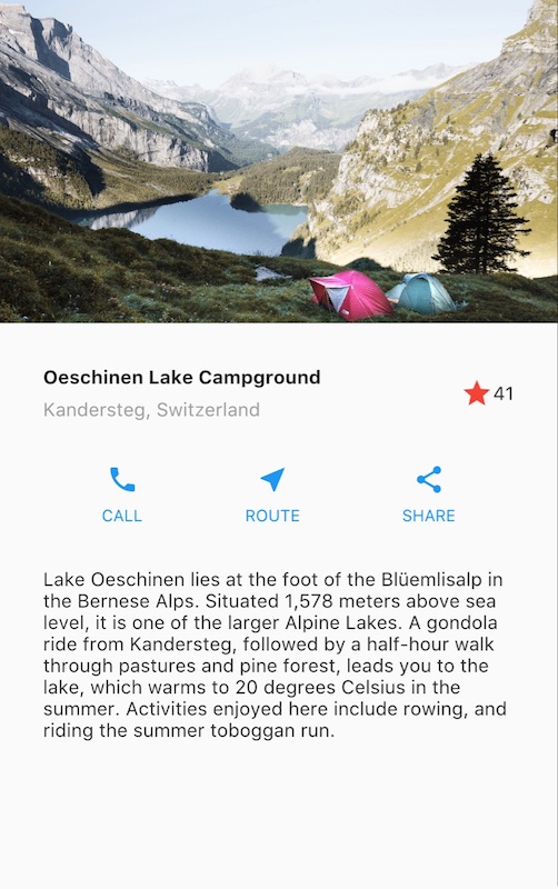
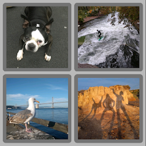
这是在Flutter中构建布局的指南。首先,您将构建以下屏幕截图的布局。然后回过头, 本指南将解释Flutter的布局方法,并说明如何在屏幕上放置一个widget。在讨论如何水平和垂直放置widget之后,会介绍一些最常见的布局widget:
构建布局
如果你想对布局机制有一个“全貌”的理解,请参考Flutter的布局方法
第0步: 设置
首先, 获取代码:
- 确保您已经安装好了 set up 您的Flutter环境.
- 创建一个基本的Flutter应用程序.
接下来,将图像添加到示例中:
- 在工程根目录创建一个
images文件夹. - 添加
lake.jpg. (请注意,wget不能保存此二进制文件。) - 更新
pubspec.yaml文件以包含assets标签. 这样才会使您的图片在代码中可用。
第一步: 绘制布局图
第一步是将布局拆分成基本的元素:
- 找出行和列.
- 布局包含网格吗?
- 有重叠的元素吗?
- 是否需要选项卡?
- 注意需要对齐、填充和边框的区域.
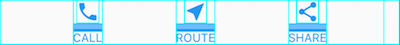
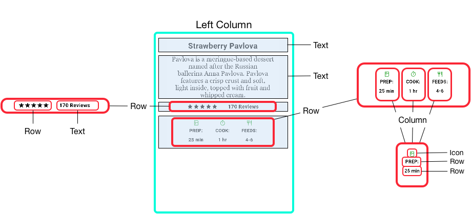
首先,确定更大的元素。在这个例子中,四个元素排列成一列:一个图像,两个行和一个文本块
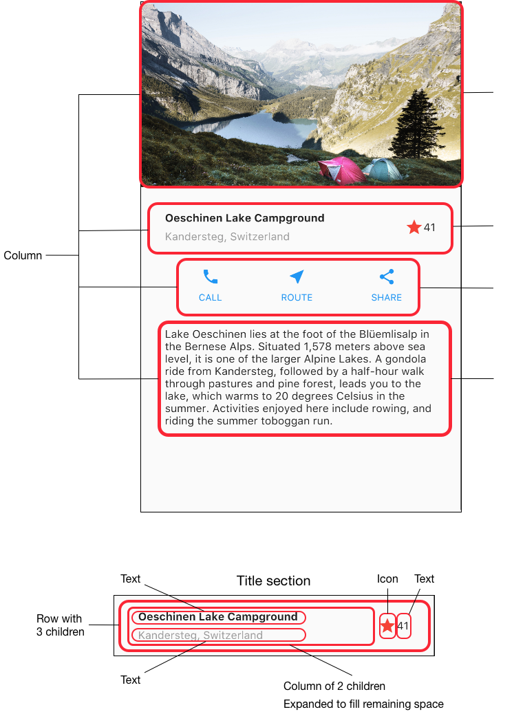
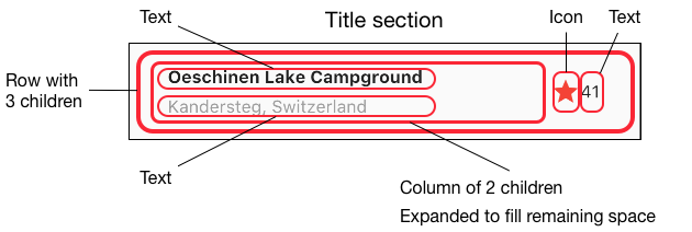
接下来,绘制每一行。第一行称其为标题部分,有三个子项:一列文字,一个星形图标和一个数字。它的第一个子项,列,包含2行文字。 第一列占用大量空间,所以它必须包装在Expanded widget中。
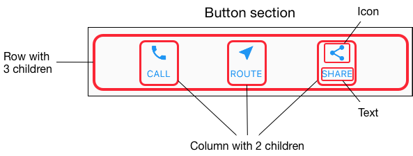
第二行称其为按钮部分,也有3个子项:每个子项都是一个包含图标和文本的列。
一旦拆分好布局,最简单的就是采取自下而上的方法来实现它。为了最大限度地减少深度嵌套布局代码的视觉混淆,将一些实现放置在变量和函数中。
Step 2: 实现标题行
首先,构建标题部分左边栏。将Column(列)放入Expanded中会拉伸该列以使用该行中的所有剩余空闲空间。 设置crossAxisAlignment属性值为CrossAxisAlignment.start,这会将该列中的子项左对齐。
将第一行文本放入Container中,然后底部添加8像素填充。列中的第二个子项(也是文本)显示为灰色。
标题行中的最后两项是一个红色的星形图标和文字“41”。将整行放在容器中,并沿着每个边缘填充32像素
这是实现标题行的代码。
class MyApp extends StatelessWidget {
  @override
  Widget build(BuildContext context) {
    Widget titleSection = new Container(
      padding: const EdgeInsets.all(32.0),
      child: new Row(
        children: [
          new Expanded(
            child: new Column(
              crossAxisAlignment: CrossAxisAlignment.start,
              children: [
                new Container(
                  padding: const EdgeInsets.only(bottom: 8.0),
                  child: new Text(
                    'Oeschinen Lake Campground',
                    style: new TextStyle(
                      fontWeight: FontWeight.bold,
                    ),
                  ),
                ),
                new Text(
                  'Kandersteg, Switzerland',
                  style: new TextStyle(
                    color: Colors.grey[500],
                  ),
                ),
              ],
            ),
          ),
          new Icon(
            Icons.star,
            color: Colors.red[500],
          ),
          new Text('41'),
        ],
      ),
    );
  //...
}第3步: 实现按钮行
按钮部分包含3个使用相同布局的列 - 上面一个图标,下面一行文本。该行中的列平均分布行空间, 文本和图标颜色为主题中的primary color,它在应用程序的build()方法中设置为蓝色:
class MyApp extends StatelessWidget {
  @override
  Widget build(BuildContext context) {
    //...

    return new MaterialApp(
      title: 'Flutter Demo',
      theme: new ThemeData(
        primarySwatch: Colors.blue,
      ),

    //...
}
由于构建每个列的代码几乎是相同的,因此使用一个嵌套函数,如buildButtonColumn,它会创建一个颜色为primary color,包含一个Icon和Text的 Widget 列。
class MyApp extends StatelessWidget {
  @override
  Widget build(BuildContext context) {
    //...

    Column buildButtonColumn(IconData icon, String label) {
      Color color = Theme.of(context).primaryColor;

      return new Column(
        mainAxisSize: MainAxisSize.min,
        mainAxisAlignment: MainAxisAlignment.center,
        children: [
          new Icon(icon, color: color),
          new Container(
            margin: const EdgeInsets.only(top: 8.0),
            child: new Text(
              label,
              style: new TextStyle(
                fontSize: 12.0,
                fontWeight: FontWeight.w400,
                color: color,
              ),
            ),
          ),
        ],
      );
    }
  //...
}
构建函数将图标直接添加到列(Column)中。将文本放入容器以在文本上方添加填充,将其与图标分开。
通过调用函数并传递icon和文本来构建这些列。然后在行的主轴方向通过 MainAxisAlignment.spaceEvenly 平均的分配每个列占据的行空间。
class MyApp extends StatelessWidget {
  @override
  Widget build(BuildContext context) {
    //...

    Widget buttonSection = new Container(
      child: new Row(
        mainAxisAlignment: MainAxisAlignment.spaceEvenly,
        children: [
          buildButtonColumn(Icons.call, 'CALL'),
          buildButtonColumn(Icons.near_me, 'ROUTE'),
          buildButtonColumn(Icons.share, 'SHARE'),
        ],
      ),
    );
  //...
}
第4步:实现文本部分
将文本放入容器中,以便沿每条边添加32像素的填充。softwrap属性表示文本是否应在软换行符(例如句点或逗号)之间断开。
class MyApp extends StatelessWidget {
  @override
  Widget build(BuildContext context) {
    //...

    Widget textSection = new Container(
      padding: const EdgeInsets.all(32.0),
      child: new Text(
        '''
Lake Oeschinen lies at the foot of the Blüemlisalp in the Bernese Alps. Situated 1,578 meters above sea level, it is one of the larger Alpine Lakes. A gondola ride from Kandersteg, followed by a half-hour walk through pastures and pine forest, leads you to the lake, which warms to 20 degrees Celsius in the summer. Activities enjoyed here include rowing, and riding the summer toboggan run.
        ''',
        softWrap: true,
      ),
    );
  //...
}
第5步:实现图像部分
四列元素中的三个现在已经完成,只剩下图像部分。该图片可以在Creative Commons许可下在线获得, 但是它非常大,且下载缓慢。在步骤0中,您已经将该图像包含在项目中并更新了pubspec文件,所以现在可以从代码中直接引用它:
body: new ListView(
  children: [
    new Image.asset(
      'images/lake.jpg',
      height: 240.0,
      fit: BoxFit.cover,
    ),
    // ...
  ],
)
BoxFit.cover 告诉框架,图像应该尽可能小,但覆盖整个渲染框
Step 6: 整合
在最后一步,你将上面这些组装在一起。这些widget放置到ListView中,而不是列中,因为在小设备上运行应用程序时,ListView会自动滚动。
//...
body: new ListView(
  children: [
    new Image.asset(
      'images/lake.jpg',
      width: 600.0,
      height: 240.0,
      fit: BoxFit.cover,
    ),
    titleSection,
    buttonSection,
    textSection,
  ],
),
//...
Dart 代码: main.dart
Image: images
Pubspec: pubspec.yaml
结束了!当您热重载应用程序时,就会看到和截图中相同界面。您可以参考 给Flutter APP 添加交互来给您的应用添加交互。
Flutter的布局方法
重点是什么?
- Widgets 是用于构建UI的类.
- Widgets 用于布局和UI元素.
- 通过简单的widget来构建复杂的widget
Flutter布局机制的核心就是widget。在Flutter中,几乎所有东西都是一个widget - 甚至布局模型都是widget。您在Flutter应用中看到的图像、图标和文本都是widget。 甚至你看不到的东西也是widget,例如行(row)、列(column)以及用来排列、约束和对齐这些可见widget的网格(grid)。
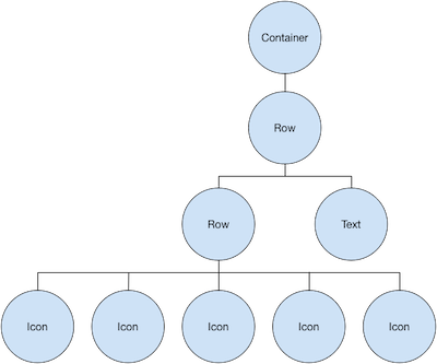
您可以通过构建widget来构建更复杂的widget。例如,下面左边的屏幕截图显示了3个图标,每个图标下有一个标签:
第二个屏幕截图显示布局结构,显示一个行包含3列,其中每列包含一个图标和一个标签。
以下是此UI的widget树示意图:
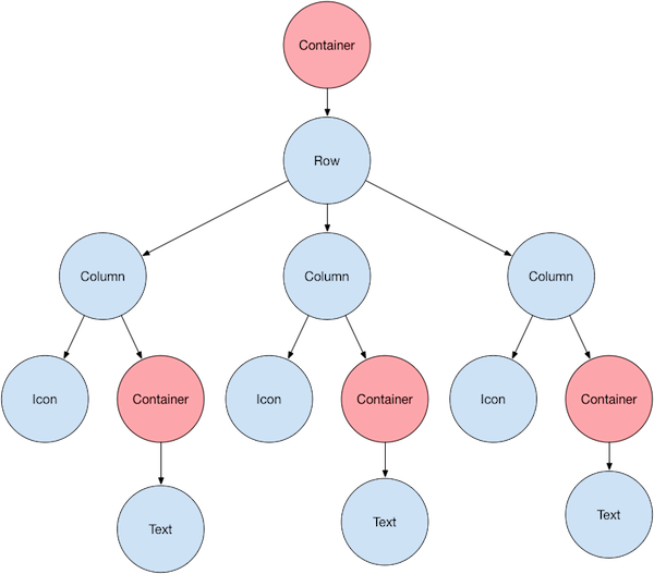
大部分应该看起来应该像您所期望的,但你可能想了解一下Container(以粉红色显示)。 Container也是一个widget,允许您自定义其子widget。如果要添加填充,边距,边框或背景色,请使用Container来设置(译者语:只有容器有这些属性)。
在这个例子中,每个Text放置在Container中以添加边距。整个行也被放置在容器中以在行的周围添加填充。
本例UI中的其他部分也可以通过属性来控制。使用其color属性设置图标的颜色。使用Text的style属性来设置字体,颜色,粗细等。列和行的属性允许您指定他们的子项如何垂直或水平对齐,以及应该占据多少空间。
布局一个 widget
重点是什么?
- 即使应用程序本身也是一个 widget.
- 创建一个widget并将其添加到布局widget中是很简单的.
- 要在设备上显示widget,请将布局widget添加到 app widget中。
- 使用Scaffold是最容易的,它是 Material Components库中的一个widget,它提供了一个默认banner,背景颜色,并且具有添加drawer,snack bar和底部sheet的API。
- 如果您愿意,可以构建仅使用标准widget库中的widget来构建您的应用程序
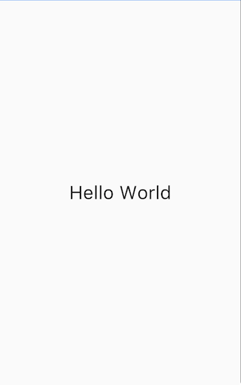
如何在Flutter中布局单个widget?本节介绍如何创建一个简单的widget并将其显示在屏幕上。它还展示了一个简单的Hello World应用程序的完整代码。
在Flutter中,只需几个步骤即可在屏幕上放置文本,图标或图像。
-
选择一个widget来保存该对象。
根据您想要对齐或约束可见窗口小部件的方式,从各种布局widget中进行选择, 因为这些特性通常会传递到所包含的widget中。这个例子使用Center,它可以将内容水平和垂直居中。 -
创建一个widget来容纳可见对象
例如,创建一个Text widget:
new Text('Hello World', style: new TextStyle(fontSize: 32.0))创建一个 Image widget:
new Image.asset('images/myPic.jpg', fit: BoxFit.cover)创建一个 Icon widget:
new Icon(Icons.star, color: Colors.red[500]) -
将可见widget添加到布局widget.
所有布局widget都有一个child属性(例如Center或Container),或者一个children属性,如果他们需要一个widget列表(例如Row,Column,ListView或Stack)。将Text widget添加到Center widget:
new Center( child: new Text('Hello World', style: new TextStyle(fontSize: 32.0)) -
将布局widget添加到页面.
Flutter应用本身就是一个widget,大部分widget都有一个build()方法。在应用程序的build方法中创建会在设备上显示的widget。 对于Material应用程序,您可以将Center widget直接添加到body属性中class _MyHomePageState extends State<MyHomePage> { @override Widget build(BuildContext context) { return new Scaffold( appBar: new AppBar( title: new Text(widget.title), ), body: new Center( child: new Text('Hello World', style: new TextStyle(fontSize: 32.0)), ), ); } }对于非Material应用程序,您可以将Center widget添加到应用程序的
build()方法中:// 这个App没有使用Material组件, 如Scaffold. // 一般来说, app没有使用Scaffold的话,会有一个黑色的背景和一个默认为黑色的文本颜色。 // 这个app,将背景色改为了白色,并且将文本颜色改为了黑色以模仿Material app import 'package:flutter/material.dart'; void main() { runApp(new MyApp()); } class MyApp extends StatelessWidget { @override Widget build(BuildContext context) { return new Container( decoration: new BoxDecoration(color: Colors.white), child: new Center( child: new Text('Hello World', textDirection: TextDirection.ltr, style: new TextStyle(fontSize: 40.0, color: Colors.black87)), ), ); } }请注意,默认情况下,非Material应用程序不包含AppBar,标题或背景颜色。 如果您想在非Material应用程序中使用这些功能,您必须自己构建它们。此应用程序将背景颜色更改为白色,将文本更改为深灰色以模仿Material应用程序。
好了! 当你运行这个应用时,你会看到:
Dart 代码 (Material app): main.dart
Dart 代码 (仅使用标准Widget的app): main.dart
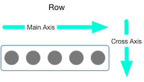
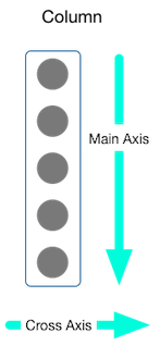
垂直和水平放置多个widget
最常见的布局模式之一是垂直或水平排列widget。您可以使用行(Row)水平排列widget,并使用列(Column)垂直排列widget。
重点是什么?
- 行和列是两种最常用的布局模式。
- 行和列都需要一个子widget列表。
- 子widget本身可以是行、列或其他复杂widget。
- 您可以指定行或列如何在垂直或水平方向上对齐其子项
- 您可以拉伸或限制特定的子widget.
- 您可以指定子widget如何使用行或列的可用空间.
Contents
要在Flutter中创建行或列,可以将一个widget列表添加到Row 或Column 中。 同时,每个孩子本身可以是一个Row或一个Column,依此类推。以下示例显示如何在行或列内嵌套行或列。
此布局按行组织。该行包含两个孩子:左侧的一列和右侧的图片:
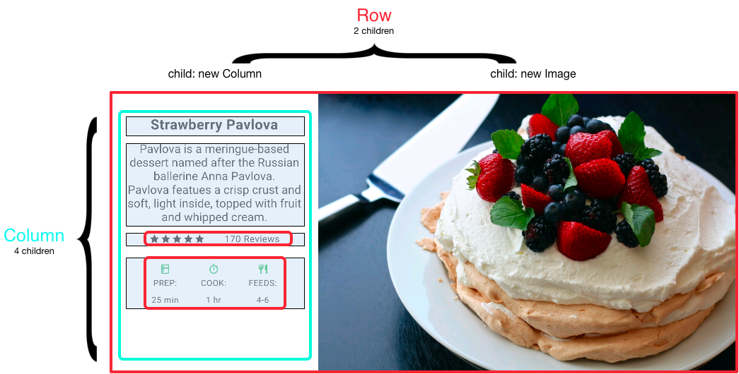
左侧的Column widget树嵌套行和列。
您将在嵌套行和列中实现一些Pavlova(图片中的奶油水果蛋白饼)的布局代码
对齐 widgets
您可以控制行或列如何使用mainAxisAlignment和crossAxisAlignment属性来对齐其子项。
对于行(Row)来说,主轴是水平方向,横轴垂直方向。对于列(Column)来说,主轴垂直方向,横轴水平方向。
MainAxisAlignment 和CrossAxisAlignment 类提供了很多控制对齐的常量.
在以下示例中,3个图像中的每一个都是100像素宽。渲染盒(在这种情况下,整个屏幕)宽度超过300个像素,
因此设置主轴对齐方式为spaceEvenly,它会在每个图像之间,之前和之后均匀分配空闲的水平空间。
appBar: new AppBar(
  title: new Text(widget.title),
),
body: new Center(
  child: new Row(
    mainAxisAlignment: MainAxisAlignment.spaceEvenly,
    children: [
      new Image.asset('images/pic1.jpg'),
Dart code: main.dart
Images: images
Pubspec: pubspec.yaml
列的工作方式与行相同。以下示例显示了一列,包含3个图片,每个图片高100个像素。
渲染盒(在这种情况下,整个屏幕)的高度大于300像素,因此设置主轴对齐方式为spaceEvenly,它会在每个图像之间,上方和下方均匀分配空闲的垂直空间。
appBar: new AppBar(
  title: new Text(widget.title),
),
body: new Center(
  child: new Column(
    mainAxisAlignment: MainAxisAlignment.spaceEvenly,
    children: [
      new Image.asset('images/pic1.jpg'),
Dart code: main.dart
Images: images
Pubspec: pubspec.yaml
调整 widget
也许你想要一个widget占据其兄弟widget两倍的空间。您可以将行或列的子项放置在Expandedwidget中, 以控制沿着主轴方向的widget大小。Expanded widget具有一个flex属性,它是一个整数,用于确定widget的弹性系数,默认弹性系数是1。
例如,要创建一个由三个widget组成的行,其中中间widget的宽度是其他两个widget的两倍,将中间widget的弹性系数设置为2:
appBar: new AppBar(
  title: new Text(widget.title),
),
body: new Center(
  child: new Row(
    crossAxisAlignment: CrossAxisAlignment.center,
    children: [
      new Expanded(
        child: new Image.asset('images/pic1.jpg'),
      ),
      new Expanded(
        flex: 2,
        child: new Image.asset('images/pic2.jpg'),
      ),
      new Expanded(
Dart code: main.dart
Images: images
Pubspec: pubspec.yaml
要修复上一节中的示例:其中一行有3张图片,行对于其渲染框太宽,并且导致右边出现红色条中的问题,可以使用Expanded widget来包装每个widget。 默认情况下,每个widget的弹性系数为1,将行的三分之一分配给每个小部件。
appBar: new AppBar(
  title: new Text(widget.title),
),
body: new Center(
  child: new Row(
    crossAxisAlignment: CrossAxisAlignment.center,
    children: [
      new Expanded(
        child: new Image.asset('images/pic1.jpg'),
      ),
      new Expanded(
        child: new Image.asset('images/pic2.jpg'),
      ),
      new Expanded(
Dart code: main.dart
Images: images
Pubspec: pubspec.yaml
聚集 widgets
默认情况下,行或列沿着其主轴会尽可能占用尽可能多的空间,但如果要将孩子紧密聚集在一起,可以将mainAxisSize设置为MainAxisSize.min。 以下示例使用此属性将星形图标聚集在一起(如果不聚集,五张星形图标会分散开)。
class _MyHomePageState extends State<MyHomePage> {
  @override
  Widget build(BuildContext context) {
    var packedRow = new Row(
      mainAxisSize: MainAxisSize.min,
      children: [
        new Icon(Icons.star, color: Colors.green[500]),
        new Icon(Icons.star, color: Colors.green[500]),
        new Icon(Icons.star, color: Colors.green[500]),
        new Icon(Icons.star, color: Colors.black),
        new Icon(Icons.star, color: Colors.black),
      ],
    );

  // ...
}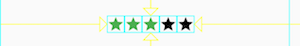
Dart code: main.dart
Icons: Icons class
Pubspec: pubspec.yaml
嵌套行和列
布局框架允许您根据需要在行和列内部再嵌套行和列。让我们看下面红色边框圈起来部分的布局代码:
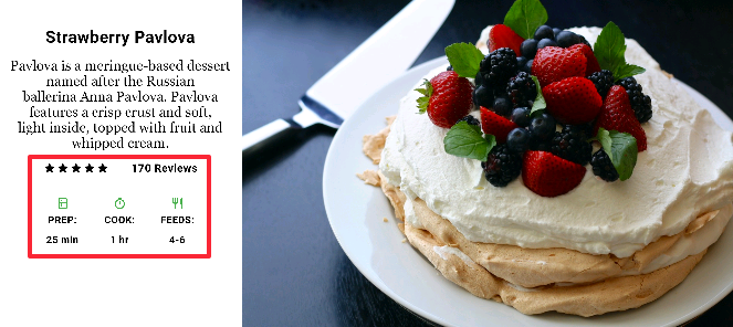
红色边框部分的布局通过两个行来实现。评级行包含五颗星和评论数量。图标行包含三列图标和文本。
评级行的widget树:
该ratings变量创建一个包含5个星形图标和一个文本的行:
class _MyHomePageState extends State<MyHomePage> {
  @override
  Widget build(BuildContext context) {
    //...

    var ratings = new Container(
      padding: new EdgeInsets.all(20.0),
      child: new Row(
        mainAxisAlignment: MainAxisAlignment.spaceEvenly,
        children: [
          new Row(
            mainAxisSize: MainAxisSize.min,
            children: [
              new Icon(Icons.star, color: Colors.black),
              new Icon(Icons.star, color: Colors.black),
              new Icon(Icons.star, color: Colors.black),
              new Icon(Icons.star, color: Colors.black),
              new Icon(Icons.star, color: Colors.black),
            ],
          ),
          new Text(
            '170 Reviews',
            style: new TextStyle(
              color: Colors.black,
              fontWeight: FontWeight.w800,
              fontFamily: 'Roboto',
              letterSpacing: 0.5,
              fontSize: 20.0,
            ),
          ),
        ],
      ),
    );
    //...
  }
}评级行下方的图标行包含3列; 每个列都包含一个图标和两行文本,您可以在其widget树中看到:
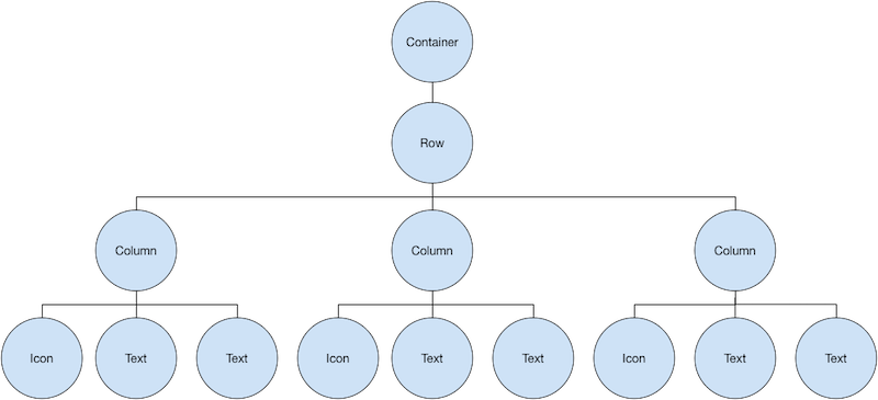
该iconList变量定义了图标行:
class _MyHomePageState extends State<MyHomePage> {
  @override
  Widget build(BuildContext context) {
    // ...

    var descTextStyle = new TextStyle(
      color: Colors.black,
      fontWeight: FontWeight.w800,
      fontFamily: 'Roboto',
      letterSpacing: 0.5,
      fontSize: 18.0,
      height: 2.0,
    );

    // DefaultTextStyle.merge可以允许您创建一个默认的文本样式,该样式会被其
    // 所有的子节点继承
    var iconList = DefaultTextStyle.merge(
      style: descTextStyle,
      child: new Container(
        padding: new EdgeInsets.all(20.0),
        child: new Row(
          mainAxisAlignment: MainAxisAlignment.spaceEvenly,
          children: [
            new Column(
              children: [
                new Icon(Icons.kitchen, color: Colors.green[500]),
                new Text('PREP:'),
                new Text('25 min'),
              ],
            ),
            new Column(
              children: [
                new Icon(Icons.timer, color: Colors.green[500]),
                new Text('COOK:'),
                new Text('1 hr'),
              ],
            ),
            new Column(
              children: [
                new Icon(Icons.restaurant, color: Colors.green[500]),
                new Text('FEEDS:'),
                new Text('4-6'),
              ],
            ),
          ],
        ),
      ),
    );
    // ...
  }
}该leftColumn变量包含评分和图标行,以及描述Pavlova的标题和文字:
class _MyHomePageState extends State<MyHomePage> {
  @override
  Widget build(BuildContext context) {
    //...

    var leftColumn = new Container(
      padding: new EdgeInsets.fromLTRB(20.0, 30.0, 20.0, 20.0),
      child: new Column(
        children: [
          titleText,
          subTitle,
          ratings,
          iconList,
        ],
      ),
    );
    //...
  }
}
左列放置在容器中以约束其宽度。最后,用整个行(包含左列和图像)放置在一个Card内构建UI:
Pavlova图片来自 Pixabay ,可以在Creative Commons许可下使用。 您可以使用Image.network直接从网上下载显示图片,但对于此示例,图像保存到项目中的图像目录中,添加到pubspec文件, 并使用Images.asset。 有关更多信息,请参阅在Flutter中添加Asserts和图片。
body: new Center(
  child: new Container(
    margin: new EdgeInsets.fromLTRB(0.0, 40.0, 0.0, 30.0),
    height: 600.0,
    child: new Card(
      child: new Row(
        crossAxisAlignment: CrossAxisAlignment.start,
        children: [
          new Container(
            width: 440.0,
            child: leftColumn,
          ),
          mainImage,
        ],
      ),
    ),
  ),
),
Dart code: main.dart
Images: images
Pubspec: pubspec.yaml
常用布局widgets
Flutter拥有丰富的布局widget,但这里有一些最常用的布局widget。其目的是尽可能快地让您构建应用并运行,而不是让您淹没在整个完整的widget列表中。 有关其他可用widget的信息,请参阅widget概述,或使用API 参考 docs文档中的搜索框。 此外,API文档中的widget页面经常会推荐一些可能更适合您需求的类似widget。
以下widget分为两类:widgets library中的标准widget和Material Components library中的专用widget 。 任何应用程序都可以使用widgets library中的widget,但只有Material应用程序可以使用Material Components库。
标准 widgets
-
- Container
- 添加 padding, margins, borders, background color, 或将其他装饰添加到widget.
-
- GridView
- 将 widgets 排列为可滚动的网格.
-
- ListView
- 将widget排列为可滚动列表
-
- Stack
- 将widget重叠在另一个widget之上.
Material Components
Container
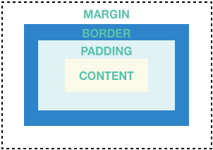
许多布局会自由使用容器来使用padding分隔widget,或者添加边框(border)或边距(margin)。您可以通过将整个布局放入容器并更改其背景颜色或图片来更改设备的背景。
Container 概要 :
- 添加padding, margins, borders
- 改变背景颜色或图片
- 包含单个子widget,但该子widget可以是Row,Column,甚至是widget树的根
Container 示例:
除了下面的例子之外,本教程中的许多示例都使用了Container。 您还可以在Flutter Gallery中找到更多容器示例。
该布局中每个图像使用一个Container来添加一个圆形的灰色边框和边距。然后使用容器将列背景颜色更改为浅灰色。
Dart code: main.dart, snippet below
Images: images
Pubspec: pubspec.yaml
class _MyHomePageState extends State<MyHomePage> {
  @override
  Widget build(BuildContext context) {

    var container = new Container(
      decoration: new BoxDecoration(
        color: Colors.black26,
      ),
      child: new Column(
        children: [
          new Row(
            children: [
              new Expanded(
                child: new Container(
                  decoration: new BoxDecoration(
                    border: new Border.all(width: 10.0, color: Colors.black38),
                    borderRadius:
                        const BorderRadius.all(const Radius.circular(8.0)),
                  ),
                  margin: const EdgeInsets.all(4.0),
                  child: new Image.asset('images/pic1.jpg'),
                ),
              ),
              new Expanded(
                child: new Container(
                  decoration: new BoxDecoration(
                    border: new Border.all(width: 10.0, color: Colors.black38),
                    borderRadius:
                        const BorderRadius.all(const Radius.circular(8.0)),
                  ),
                  margin: const EdgeInsets.all(4.0),
                  child: new Image.asset('images/pic2.jpg'),
                ),
              ),
            ],
          ),
          // ...
          // See the definition for the second row on GitHub:
          // https://raw.githubusercontent.com/flutter/website/master/_includes/code/layout/container/main.dart
        ],
      ),
    );
    //...
  }
}
GridView
使用GridView将widget放置为二维列表。 GridView提供了两个预制list,或者您可以构建自定义网格。当GridView检测到其内容太长而不适合渲染框时,它会自动滚动。
GridView 概览:
- 在网格中放置widget
- 检测列内容超过渲染框时自动提供滚动
- 构建您自己的自定义grid,或使用一下提供的grid之一:
GridView.count允许您指定列数GridView.extent允许您指定项的最大像素宽度
GridView 示例:
使用GridView.extent 创建最大宽度为150像素的网格
Dart code: main.dart, snippet below
Images: images
Pubspec: pubspec.yaml
使用GridView.count 在纵向模式下创建两个行的grid,并在横向模式下创建3个行的网格。通过为每个GridTile设置footer属性来创建标题。
Dart code: grid_list_demo.dart
from the Flutter
Gallery
// The images are saved with names pic1.jpg, pic2.jpg...pic30.jpg.
// The List.generate constructor allows an easy way to create
// a list when objects have a predictable naming pattern.

List<Container> _buildGridTileList(int count) {

  return new List<Container>.generate(
      count,
      (int index) =>
          new Container(child: new Image.asset('images/pic${index+1}.jpg')));
}

Widget buildGrid() {
  return new GridView.extent(
      maxCrossAxisExtent: 150.0,
      padding: const EdgeInsets.all(4.0),
      mainAxisSpacing: 4.0,
      crossAxisSpacing: 4.0,
      children: _buildGridTileList(30));
}

class _MyHomePageState extends State<MyHomePage> {
  @override
  Widget build(BuildContext context) {
    return new Scaffold(
      appBar: new AppBar(
        title: new Text(widget.title),
      ),
      body: new Center(
        child: buildGrid(),
      ),
    );
  }
}
ListView
ListView是一个类似列的widget,它的内容对于其渲染框太长时会自动提供滚动。
ListView 摘要:
- 用于组织盒子中列表的特殊Column
- 可以水平或垂直放置
- 检测它的内容超过显示框时提供滚动
- 比Column配置少,但更易于使用并支持滚动
ListView 示例:
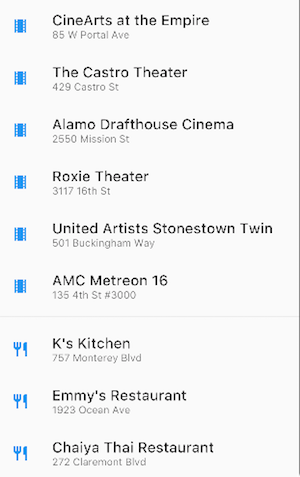
使用ListView显示多个ListTile的业务列表。分隔线将剧院与餐厅分开
Dart code: main.dart, snippet below
Icons: Icons class
Pubspec: pubspec.yaml
使用ListView控件来显示Material Design palette中的Colors
Dart code: Flutter Gallery中的
colors_demo.dart
List<Widget> list = <Widget>[
  new ListTile(
    title: new Text('CineArts at the Empire',
        style: new TextStyle(fontWeight: FontWeight.w500, fontSize: 20.0)),
    subtitle: new Text('85 W Portal Ave'),
    leading: new Icon(
      Icons.theaters,
      color: Colors.blue[500],
    ),
  ),
  new ListTile(
    title: new Text('The Castro Theater',
        style: new TextStyle(fontWeight: FontWeight.w500, fontSize: 20.0)),
    subtitle: new Text('429 Castro St'),
    leading: new Icon(
      Icons.theaters,
      color: Colors.blue[500],
    ),
  ),
  // ...
  // See the rest of the column defined on GitHub:
  // https://raw.githubusercontent.com/flutter/website/master/_includes/code/layout/listview/main.dart
];

class _MyHomePageState extends State<MyHomePage> {
  @override
  Widget build(BuildContext context) {
    return new Scaffold(
      // ...
      body: new Center(
        child: new ListView(
          children: list,
        ),
      ),
    );
  }
}
Stack
使用Stack来组织需要重叠的widget。widget可以完全或部分重叠底部widget。
Stack summary:
- 用于与另一个widget重叠的widget
- 子列表中的第一个widget是base widget; 随后的子widget被覆盖在基础widget的顶部
- Stack的内容不能滚动
- 您可以选择剪切超过渲染框的子项
Stack 示例:

使用Stack叠加Container(在半透明的黑色背景上显示其文本),放置在Circle Avatar的顶部。Stack使用alignment属性和调整文本偏移。
Dart code: main.dart, snippet below
Image: images
Pubspec: pubspec.yaml
使用Stack将gradient叠加到图像的顶部。gradient确保工具栏的图标与图片不同。
Dart code: contacts_demo.dart
class _MyHomePageState extends State<MyHomePage> {
  @override
  Widget build(BuildContext context) {
    var stack = new Stack(
      alignment: const Alignment(0.6, 0.6),
      children: [
        new CircleAvatar(
          backgroundImage: new AssetImage('images/pic.jpg'),
          radius: 100.0,
        ),
        new Container(
          decoration: new BoxDecoration(
            color: Colors.black45,
          ),
          child: new Text(
            'Mia B',
            style: new TextStyle(
              fontSize: 20.0,
              fontWeight: FontWeight.bold,
              color: Colors.white,
            ),
          ),
        ),
      ],
    );
    // ...
  }
}
Card
Material Components 库中的Card包含相关内容块,可以由大多数类型的widget构成,但通常与ListTile一起使用。Card有一个子项, 但它可以是支持多个子项的列,行,列表,网格或其他小部件。默认情况下,Card将其大小缩小为0像素。您可以使用SizedBox来限制Card的大小。
在Flutter中,Card具有圆角和阴影,这使它有一个3D效果。更改Card的eelevation属性允许您控制投影效果。
例如,将elevation设置为24.0,将会使Card从视觉上抬离表面并使阴影变得更加分散。
有关支持的elevation值的列表,请参见Material guidelines中的Elevation and Shadows。
如果指定不支持的值将会完全禁用投影 。
Card 摘要:
- 实现了一个 Material Design card
- 接受单个子项,但该子项可以是Row,Column或其他包含子级列表的widget
- 显示圆角和阴影
- Card内容不能滚动
- Material Components 库的一个widget
Card 示例:
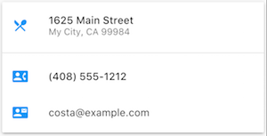 包含3个ListTiles并通过用SizedBox包装进行大小调整的Card。分隔线分隔第一个和第二个ListTiles。
Dart code: main.dart, snippet below
Icons: Icons class
Pubspec: pubspec.yaml
包含图像和文字的Card
Dart code: cards_demo.dart
from the Flutter
Gallery
class _MyHomePageState extends State<MyHomePage> {
  @override
  Widget build(BuildContext context) {
    var card = new SizedBox(
      height: 210.0,
      child: new Card(
        child: new Column(
          children: [
            new ListTile(
              title: new Text('1625 Main Street',
                  style: new TextStyle(fontWeight: FontWeight.w500)),
              subtitle: new Text('My City, CA 99984'),
              leading: new Icon(
                Icons.restaurant_menu,
                color: Colors.blue[500],
              ),
            ),
            new Divider(),
            new ListTile(
              title: new Text('(408) 555-1212',
                  style: new TextStyle(fontWeight: FontWeight.w500)),
              leading: new Icon(
                Icons.contact_phone,
                color: Colors.blue[500],
              ),
            ),
            new ListTile(
              title: new Text('costa@example.com'),
              leading: new Icon(
                Icons.contact_mail,
                color: Colors.blue[500],
              ),
            ),
          ],
        ),
      ),
    );
  //...
}
ListTile
ListTile是Material Components库中的一个专门的行级widget,用于创建包含最多3行文本和可选的行前和行尾图标的行。ListTile在Card或ListView中最常用,但也可以在别处使用。
ListTile 摘要:
- 包含最多3行文本和可选图标的专用行
- 比起Row不易配置,但更易于使用
- Material Components 库里的widget
ListTile 示例:
包含3个ListTiles的Card
Dart code: See Card examples.
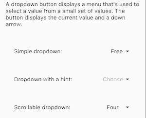
使用ListTile列出3个下拉按钮类型。
Dart code: buttons_demo.dart
from the Flutter
Gallery
资源
编写布局代码时以下资源可能会有所帮助。
- Widget 概述
介绍Flutter中提供的许多widgets。 - HTML/CSS在Flutter中的模拟
对于熟悉web开发的人员,本页将HTML / CSS功能映射到Flutter功能。 - Flutter
Gallery
一个Demo应用,展示了许多Material Design widget和其他Flutter功能。 - Flutter API documentation
所有Flutter库的参考文档。 - 处理Flutter中的框约束
讨论widgets如何受其渲染框限制。 - 在Flutter中添加 Assets 和 Images
说明如何将图像和其他资源添加到应用程序包中。 - 从零到一开始 Flutter
一个写他第一个Flutter应用程序的经验。